Web colours to use and apply in a website in 2023
Colours have a strong impact on the perception of a brand's content, products and/or services. This is due to our brain's associative network theory - an interconnected network of knowledge that links colours to lived experiences.
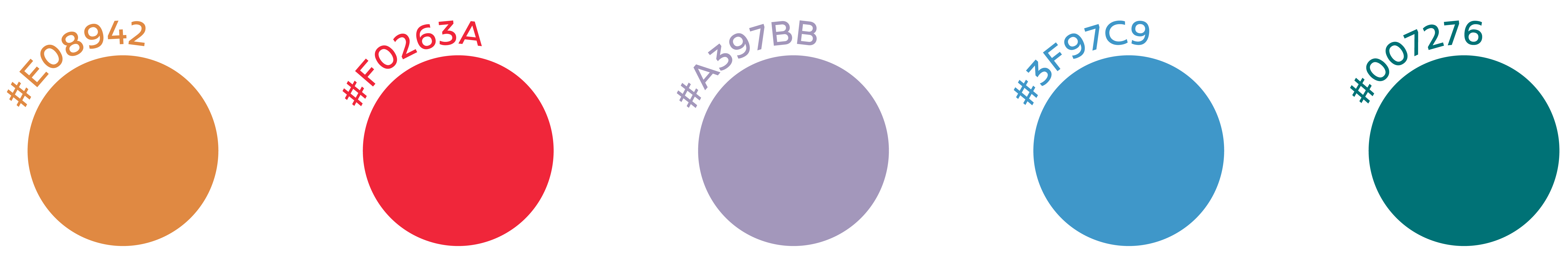
It is therefore important to know and be aware of the different trends. For 2023, we present a new colour palette dedicated to web elements, characterised by vibrant colours, the green of plants, the colour of natural materials and energy efficiency.
Turquoise
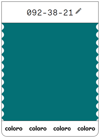
This colour is an intermediate between blue and green, and represents the characteristics of both: tranquility (blue) and growth (green). Its association with the colour of the sea allows us to associate it with tranquility, peace and emotional balance, giving a feeling of serenity and stability. On the other hand, this colour encourages introspection at the level of thoughts and feelings and is associated with self-love. It also encourages creativity.
Blue
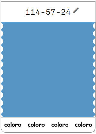
Blue means clear communication. It is a colour that embodies intelligence, efficiency, logic and commitment. It also promotes concentration and is associated with serenity and calm. It is also considered the colour of the divine, as it is the same colour as the sky and conveys a sense of immensity.
Lavander
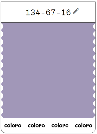
Lavender is associated with authenticity, truth and quality. It promotes deep introspection and should not be overused, as it risks conveying the opposite of what is intended.
Red
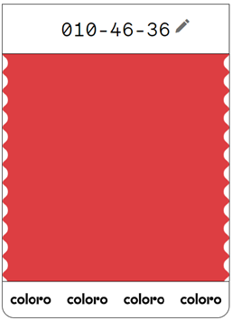
Red represents courage, strength, movement and energy. It is also the symbol of life because it is the colour of our blood. It is also the colour of passion and love and is associated with fire. Moderation is required in its use, as overuse can convey demand and aggressiveness.
Orange
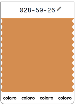
Orange is associated with warmth, energy, fun, happiness and ambition. It makes us optimistic about life, encouraging and motivating. It also conveys security and comfort, although it encourages the courage to take risks. It is an aromatic colour and is strongly associated with different tastes. It is therefore often used to represent moments of sociability, conviviality and extroversion, as it is a very communicative colour.
Web colours and 4por4
Colours are a non-verbal form of communication and cannot be reduced to visual communication as we are affected by their meanings and sensations.
It is essential to have a consistent corporate image and website that conveys the values, identity and brand attributes.
4por4 is a creative agency that works in the areas of graphic design and digital, more specifically in design, website development, branding, e-commerce, corporate image and communication media.
Whether you need a website, re-branding or a corporate image, 4por4 offers innovative and unique solutions that stand out for their customisation and excellence.
For 4por4, better than achieving is to surprise and exceed. Let's walk together?
got a project? we´d love to know a little more….

