The colors we should not use in webdesign
There are several “rules” and tips that allow a website design to be visually pleasing and appealing. Today we share our opinion about what we should not implement when it comes to choosing and combining colors.
Here are some tips on how we shouldn’t use colors in web design::
1 - Strong colors
When we want to catch and capture the user's attention, we can make the mistake of using strong and vibrant colors.
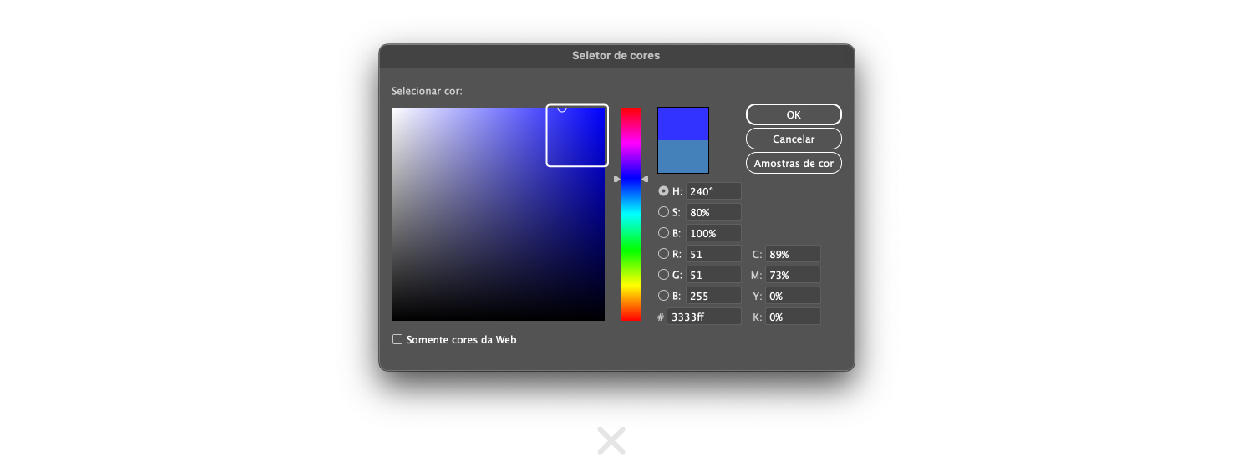
This choice will create the opposite effect, strong colors tire the vision, and this will probably mean that the user will spend less time on your website.
An easy way to understand which colors should not be used is: avoid choosing colors located in the upper right corner of the color picker.
2 - Heavy color conjugation
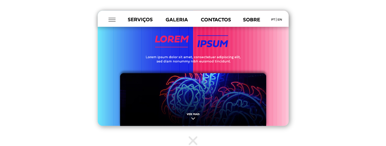
The combination of colors that can be used in webdesign must also be thought out. If you use very heavy contrasting colors, the site will be visually uncomfortable and makes the user leave it.
This does not mean that only neutral colors can be used, but rather that the combination must be thought out to create a visually balanced contrast.
3 - Conjugating colors without contrast
This example is the opposite of the previous one. Likewise, we should not use colors that are too strong to create contrast, nor should we use a combination of colors with too light a contrast.
This will make the text unreadable or some elements become imperceptible..
4 - Have multiple colors
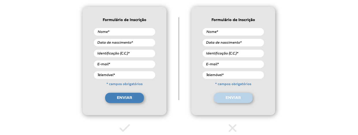
The ideal is to have just one highlight color, in order to obtain a coherent design. If blue is used as a highlight, but the next text block is green, the visual consistency doesn’t exist and makes the design confusing.
5 - Very diverse secondary colors
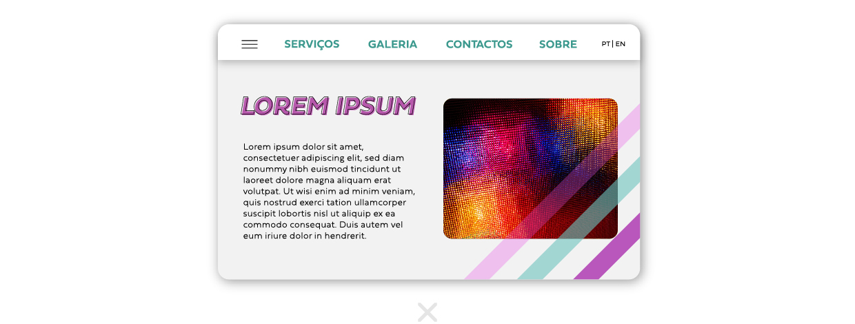
Once you've chosen your main color, you'll need extra colors to complement the design. The best option is to choose variations of the main color.
These variations can be used in details such as: hover effect (button selected/button not selected); subtle text above the main color; gradients; etc

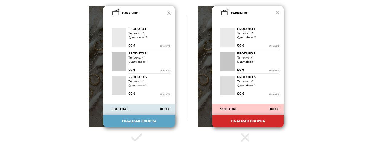
6 - Red Color
Improper use of red can become a mistake. Red is easily associated with error, so when used incorrectly it can send an inappropriate message to the visitor/user.
In the case of using this color on a button, for example, it can lead to the understanding that it is not meant to be clicked..
Conclusion
And this is why, at 4por4, we have a creative team, specialized in website development, web design, online stores, corporate image, branding and communication supports that can help you boost your online presence and reach new horizons, without committing some of the errors exposed above.
For 4por4, better than achieving is overcoming and surprising. Let´s walk together?