The importance of typography in digital and branding
Certainly, on several occasions you have spent a lot of time dedicating yourself to choosing the ideal typography for a given project, whether in graphic design or digital.
Well, testing as many typography as possible, in addition to increasing your repertoire, stimulates creativity, allows you to discover innovative visual solutions and helps you find the perfect combination that best suits the purpose of your creation.
Experimenting with different fonts, sizes, weights and styles can lead to unexpected and surprising results.
However, it is important to balance its use with coherence and readability, ensuring that the main message is not compromised.
Therefore, in the creative process, we must find the perfect combination that not only meets the design objectives, but also makes it memorable and impactful.
See below some combinations that work perfectly for 4por4:
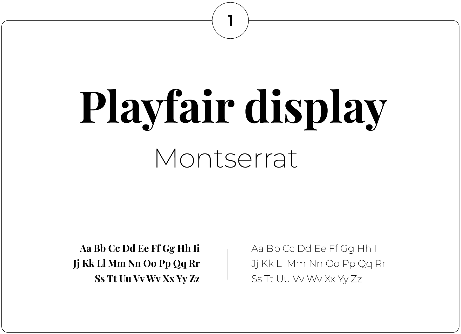
1 - Playfair & Montserrat
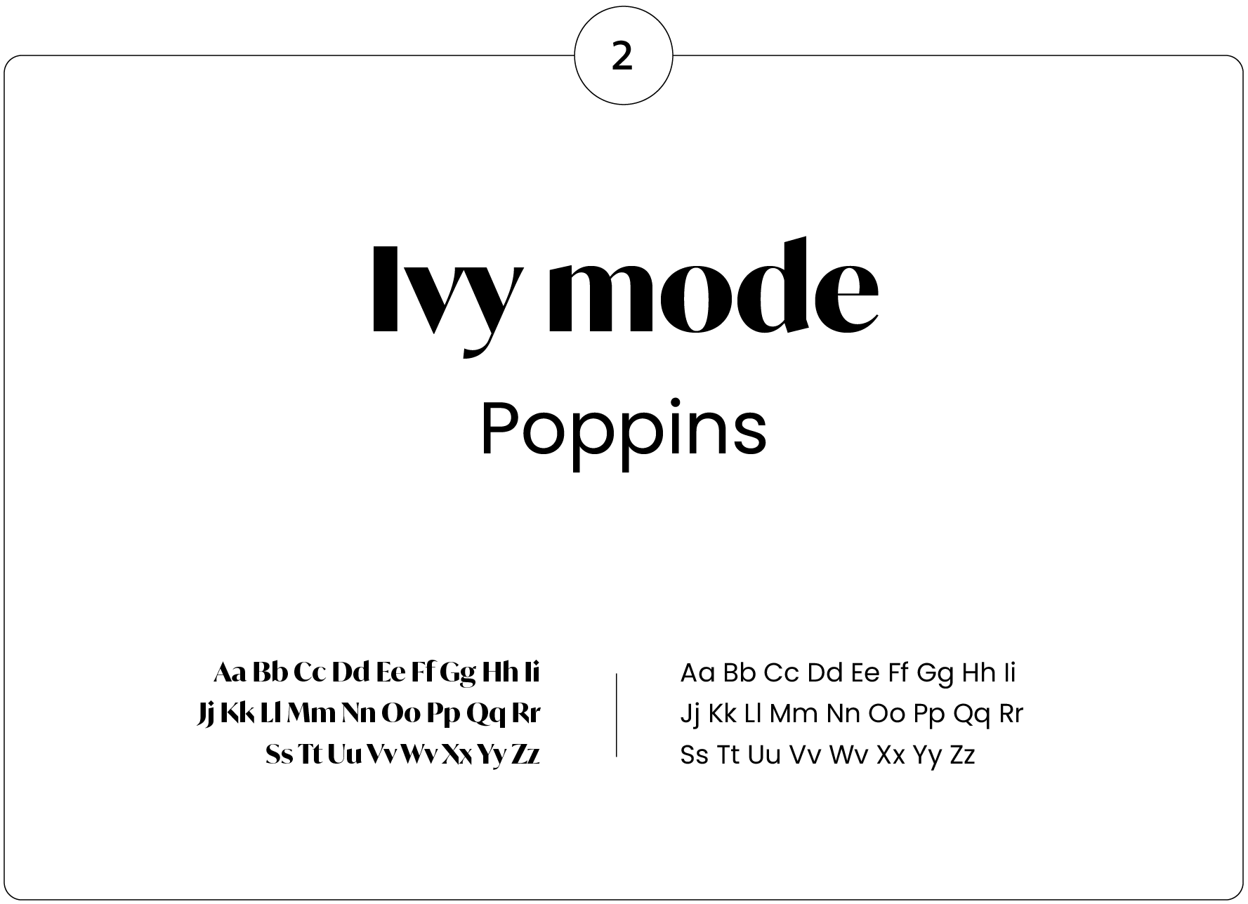
2 - Ivy Mode & Poppins
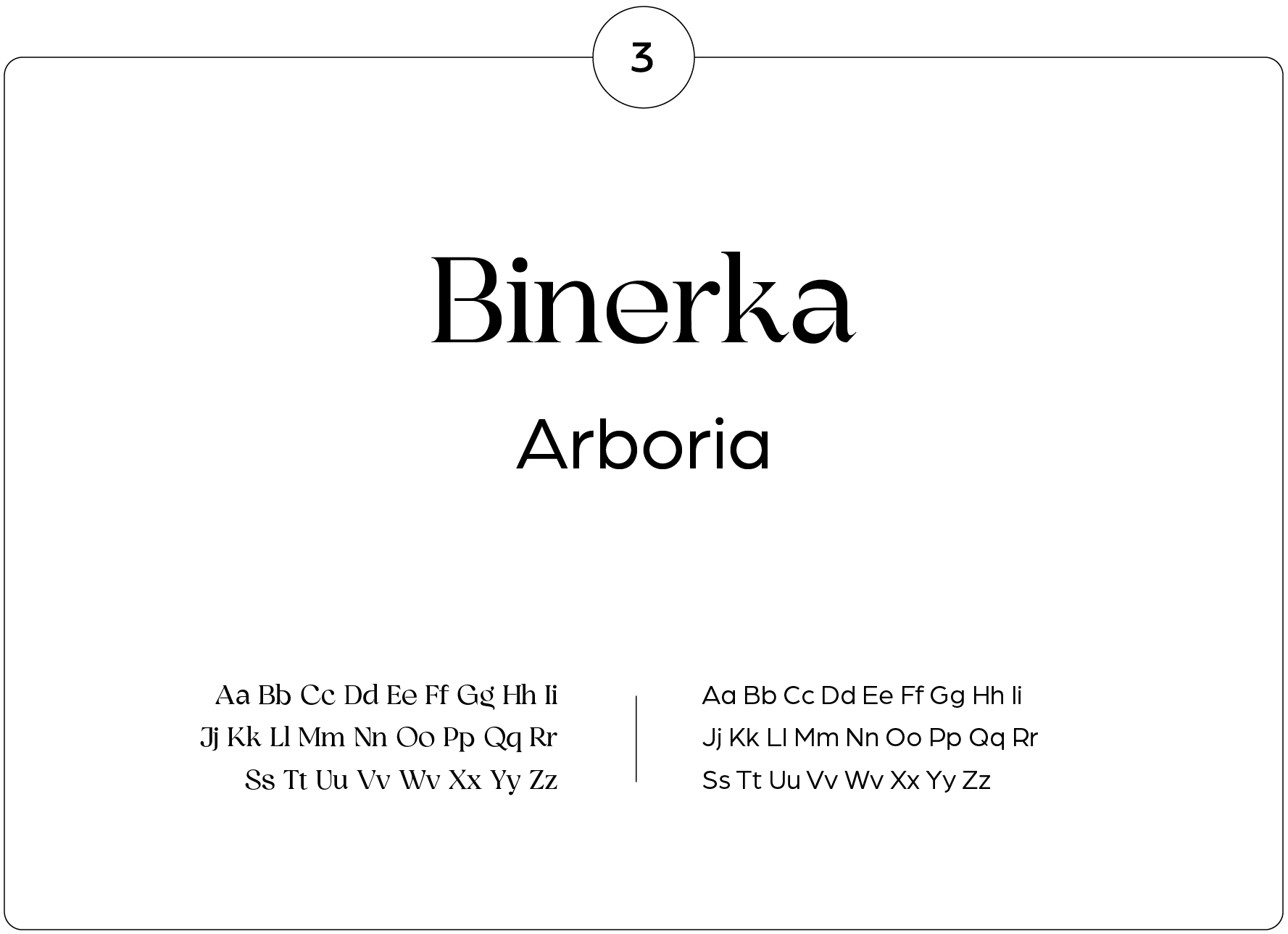
3 - Binerka & Arboria
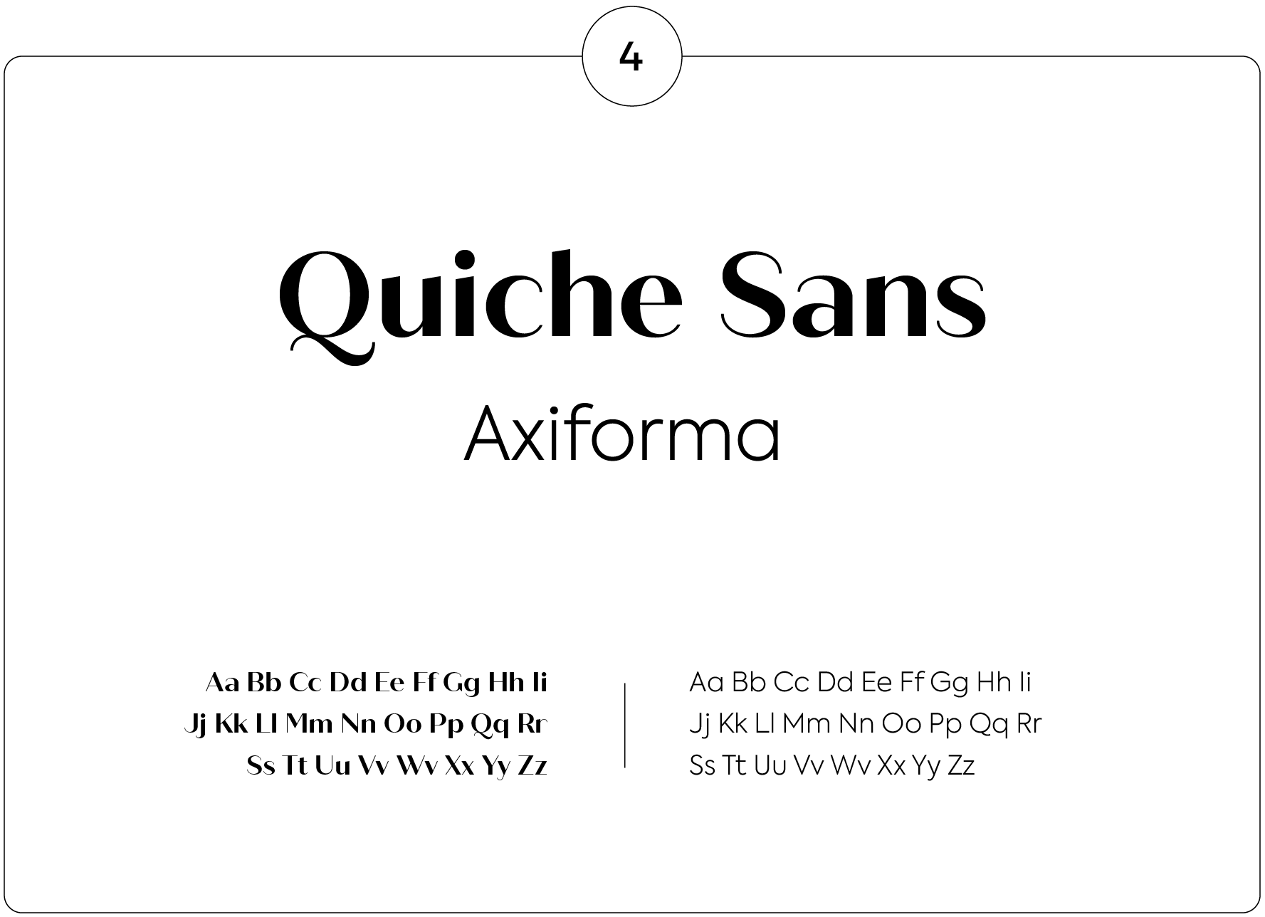
4 - Quiche Sans & Axiforma
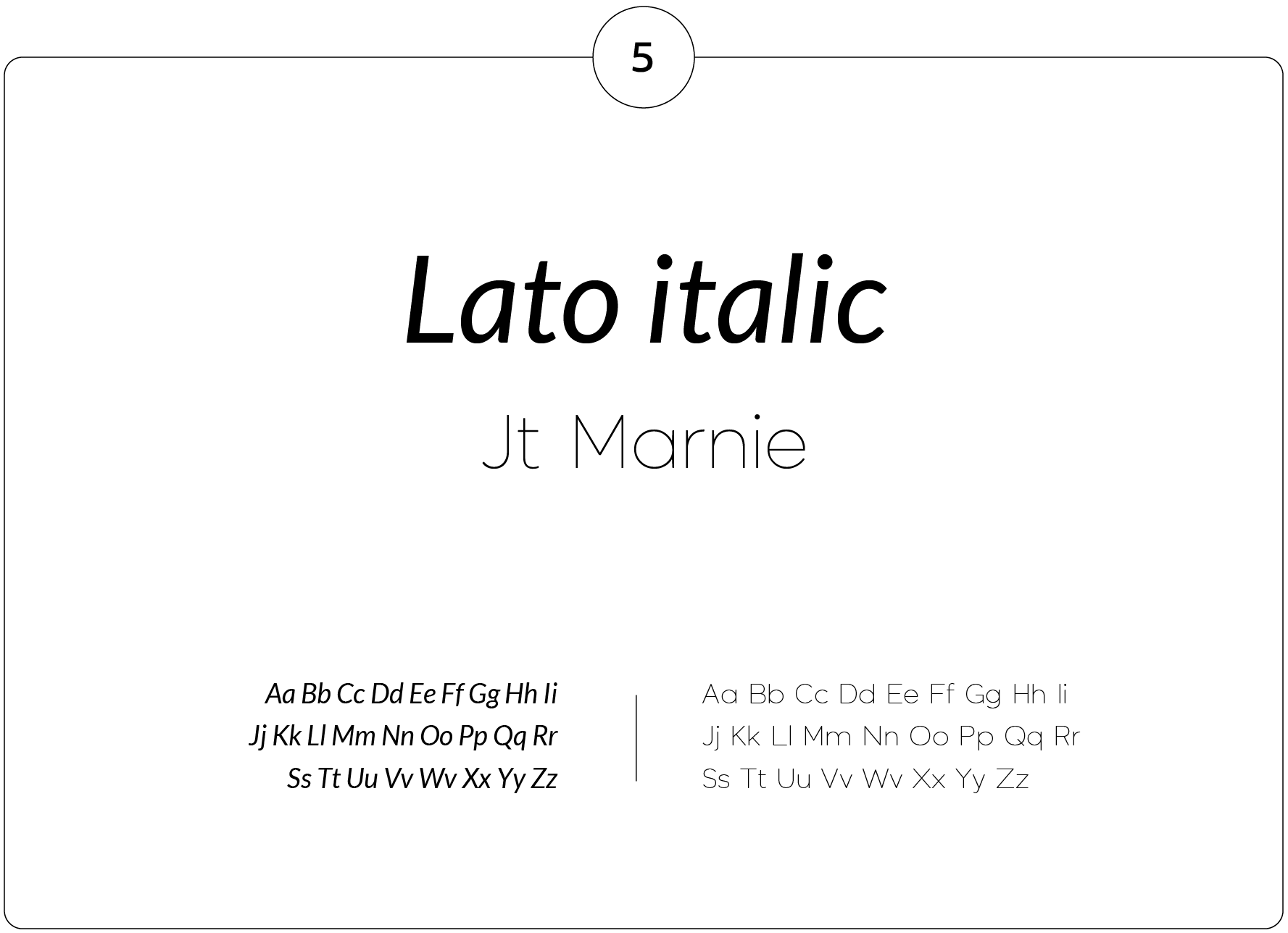
5 - Lato Italic & Jt Marnie
Conclusion
Boost your creativity and test the almost endless font possibilities.
For 4por4, better than achieving is overcoming and surprising. Let´s walk together?
got a project? we´d love to know a little more….

