Clound Dancer, the Pantone color of 2026
Every year, the Pantone Colour of the Year reflects the cultural, social and creative moment we are experiencing.
More than just a colour trend, Pantone's annual choice reflects collective moods, global influences and new ways of thinking about design, communication and creativity.
In 2026, Pantone presents 11-4201 Cloud Dancer, a light and soft shade inspired by the lightness of the sky and a sense of tranquillity in motion. A luminous and balanced colour that conveys serenity, clarity and a feeling of pause, which are increasingly valued in a context marked by excessive stimulus and constant acceleration.
Cloud Dancer emerges as a response to the fast pace of life, taking on a more conscious and strategic role in design. Its presence encourages a more thoughtful approach to how we create and communicate, making room for simplicity and visual breathing space. It is a discreet colour that supports and acts as a foundation for more sensitive and balanced languages.
In the design world, Pantone 11-4201 Cloud Dancer stands out for its ability to adapt to different contexts and disciplines. From branding and digital to editorial and physical environments, the colour plays a structural role, helping to create visual identities that are coherent, current and emotionally relevant. Its strength lies in its subtlety and the way it contributes to more balanced and engaging visual experiences.
Pantone 2026 Colour Palettes
As in previous years, the Pantone Colour of the Year is accompanied by a set of colour palettes that explore different application possibilities, demonstrating the versatility of Cloud Dancer in multiple creative contexts.
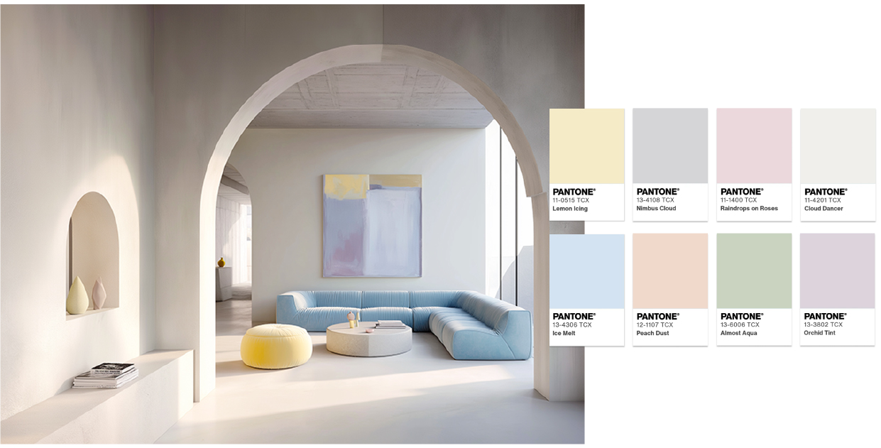
Powdered Pastels:
A delicate and soft palette made up of light, slightly muted tones that reinforce the feeling of lightness and tranquility.
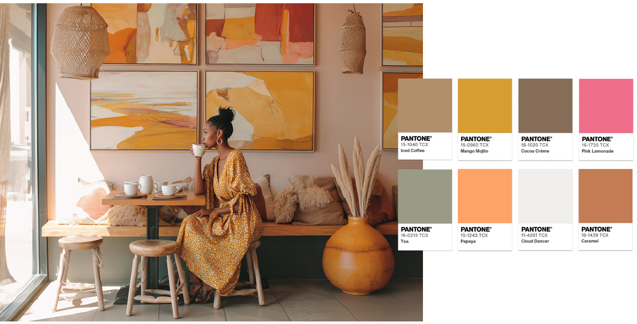
Take a Break:
This palette combines with Cloud Dancer in warmer, more natural tones, creating cosy and relaxed compositions.
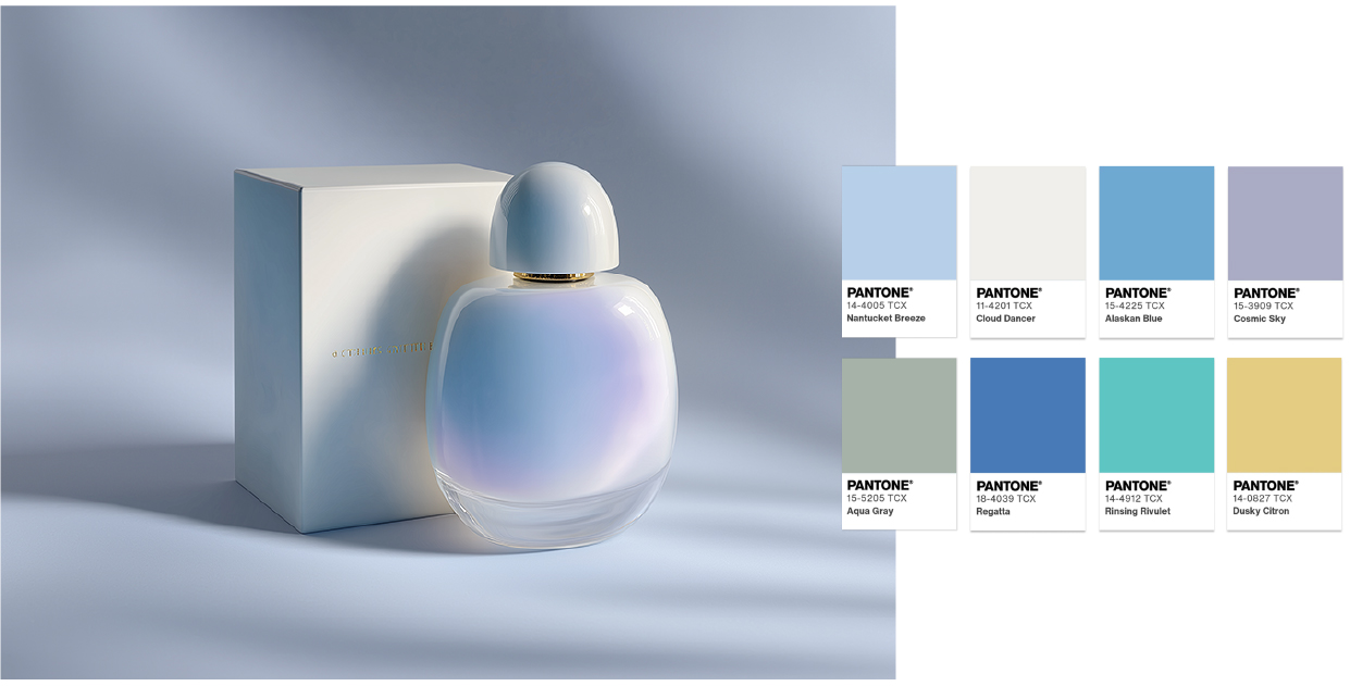
Atmospheric:
A more contemporary and expressive approach, where Cloud Dancer intersects with blues, greens and deeper tones.
Conclusions:
These palettes show how Claud Dancer can take on different roles, such as protagonist, but also as an element of balance, always maintaining a coherent and intentional visual language.
For brands, Pantone's choice reinforces the importance of colour as a strategic tool. Used consciously, Cloud Dancer helps communicate values such as proximity, trust and authenticity, helping to create connections with the public. Colour is not just an aesthetic resource but assumes an active role in how brands position themselves and relate to their audience.
At 4por4, we closely follow design and communication trends and transform them into ideas with purpose. We believe the true impact of design lies in its ability to interpret context, give it form and create relevant and lasting solutions.
For 4por4, better than achieving is overcoming and surprising. Let´s walk together?
got a project? we´d love to know a little more….

